
In the modern days of gaming, you can’t always buy games in stores, instead a lot of modern games are available on the digital market only. It’s something we’ve seen coming for years but it does take away the charm of looking for your favorite game in stores. In the past, publishers needed to stand out in the shop, box arts were often created with just this in mind. In our monthly top 10 list, we like to share our personal top 10 of box arts.
#10: Mario Kart 8 Deluxe (Nintendo Switch)
Although a lot of games release on both the digital and the physical market, this doesn’t mean that modern games don’t need a pretty cover. One of the best modern examples is without a doubt the box art of Mario Kart 8 Deluxe on Nintendo Switch. This is a good example of a box art done right. It’s very colorful so it will immediately grab your attention in stores. Besides this, the box also shows some of the key elements of the game. The anti-gravity is clearly visible and you see the extra characters such as Link racing against other new characters. A lot of attention went to this box and that’s why it definitely deserves a spot in our list.

#9: Child of Light (PS Vita)
Next on the list is the gorgeous Child of Light. We picked the PS Vita box since the blue of the Vita logo simply matches the colors of the artwork most. Again, a very beautiful box art that already shows you something more of the game. You see our small red-haired princess pulling her sword to face the danger in the distance. It gives away the fantasy/RPG vibe you can expect from the game while demonstrating the powerful and unique style of the game at the same time. Without a doubt a clever box art that once again, shows you what you can expect when you get this game. Too bad the age rating and memory information don’t really match the design.

#8: DOOM (PC)
Time for a classic, DOOM for PC. This was one of those boxes that grabbed my attention when I was just a kid, looking for a new game. The box art manages to recreate the madness of hell in just one simple image. Being a first person shooter, the box was one of the only places you could actually see our hero in action. This in combination with the amazing art and the iconic typography makes this cover worthy of an inclusion.

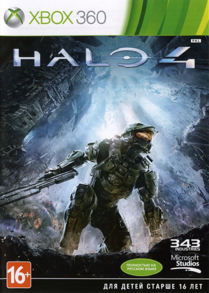
#7: Halo 4 (Xbox 360)
Another first person shooter on the list, meet the cover of Halo 4, an Xbox 360 exclusive. If you’ve played Halo before, you know the franchise isn’t afraid to include some epic moments where you’re facing off with dozens of alien forces. Not a lot of the box arts in the franchise managed to captivate this moment, we mostly saw Master Chief standing and staring towards something in the distance. Not on this box! An epic hero landing and a massive explosion behind the Chief. If you see the box you just want to play the game and find out what caused this massive explosion. Great job for the artwork department!
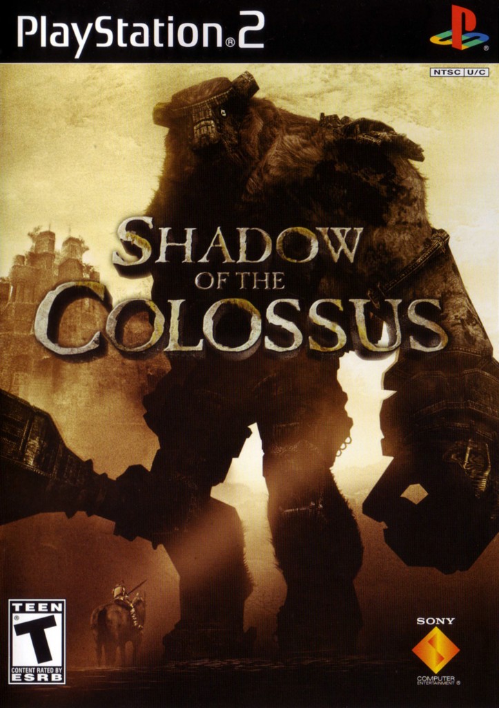
#6: Shadow of the Colossus (PlayStation 2)
The next spot is reserved for Shadow of the Colossus, after some doubt to include this one or ICO, we went for Shadow of the Colossus. The box art shows us the amazing style and art that you can find throughout the entire game but what it does best is showing you the scale of the game. You might not notice the small horse the first time you look at the box, but once you do, you realise you’ll need to conquer some giant enemies in this game. The feeling of being this small is something you’ll feel during the game as well so it’s really amazing the box already succeeds in letting you feel small and weak. Deserving a spot on the list without a doubt!
#5: Bioshock Limited Edition (Xbox 360)
Bioshock is one of the biggest surprises of the older generation. It all started with the original Bioshock game which literally made us jump underwater to find out the dark secret of Rapture. But how do you sell a new concept like this? Well, a kick-ass limited edition might help. The regular Bioshock box art was already impressive but it’s the Steelbook found in the limited edition that really takes home the crown. The metal was made to look like it has been in the water for years, looking all destroyed and fragile. Without a doubt one of the most memorable box arts in my personal collection.

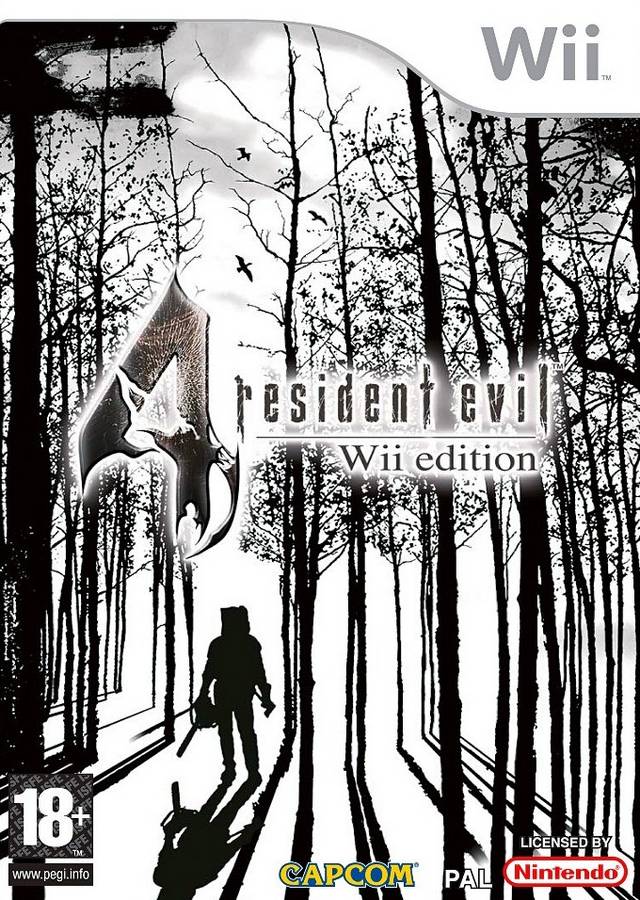
#4: Resident Evil 4 (Wii)
Another one of those classics. Resident Evil 4 was originally a GameCube exclusive but released on every other platform of that time later on. Capcom wanted the game to sell and it did. Resident Evil 4 marked a change in the franchise and is still considered one of the best Resident Evil games to date. So how would Capcom sell it on Wii years after the original release? Well, a stylish box art might work. This black & white art reminded us of an oldskool horror movie and is able to transfer the atmosphere of the game to the potential buyer. A classic box art of a classic game.
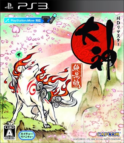
3: Okami HD (PlayStation 3)
Another Capcom classic is Okami. Released on PlayStation 2 first but ported to other consoles later on. The HD port that released on PlayStation 3 has the most memorable box art of them all (besides that IGN logo mistake on the Wii version). This box art does a great job in translating the vibe and style of the game onto a piece of plastic. The art is gorgeous and the scenery makes you want to book a flight to Japan instantly. It’s a box that you simply can’t ignore.
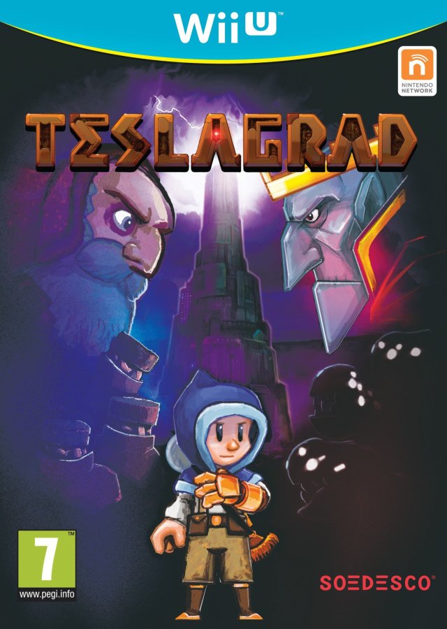
#2 Teslagrad (Wii U)
A more obscure title this time, Teslagrad on Wii. A smaller Indie game that made it as a physical game with its own box art. The box looks stunning and reminds us of classic movie posters with a modern touch to it. As many other boxes on this list, this one really manages to create a certain atmosphere and really puts a spotlight on the game’s artwork. It’s perhaps a box many of you missed since the game isn’t that big but that doesn’t mean it doesn’t deserve a place on our list! Now, let’s move over to our all-time favorite.
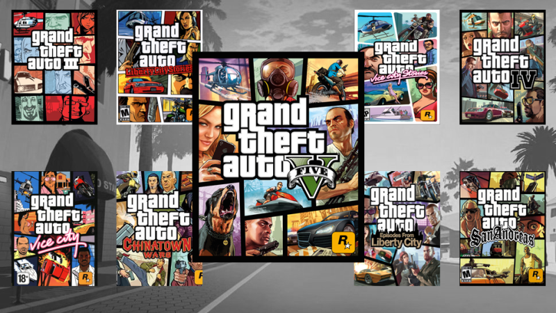
#1 Grand Theft Auto (multiplatform)
And the winner is…. The Grand Theft Auto franchise. That’s right, not just one single box art but all of them since the release of Grand Theft Auto III. It’s impressive to see that Rockstar stayed loyal to their own style during the years. Gamers all over the world recognize the GTA box thanks to its borders and small hand-drawn panels showing something typical of the game. It’s something we’re sure will stay since the box and style are part of, perhaps, the best marketing a game could wish for. We salute you Grand Theft Auto and we can’t wait to see how the box of GTA VI will look like!
And that’s it, another list. Did your favorite boxes make the list or did we miss some of them? Let us know in the comments. We like to see you again next month, for another top 10 list, stay tuned!